If you’re interested in equity in data then it’s not enough to simply design a data visualization based on ‘best practices’ and hope for the best. It’s important to go beyond hopeful good intentions and actually test whether or not your design is accidentally racist (etc) and take steps to embed equity into it. But how?
It’s important to test every aspect of a data project. Testing is what makes it Data Science. When making a data visualization, that testing should continue. There have been a variety of studies attempting to codify ‘best practices’ in data visualization but they have almost entirely been conducted on a very narrow type of audience. If equity is your goal, don’t design your communication using standards set for someone else. We’re not dismissing western academic data viz best practices, but we test them each time.
The two equity design questions you have to ask yourselves are:
- Who is my audience?
- How can I design effective communication for them?
The first question gets skipped over a lot, often because you have more than one audience and it doesn’t feel feasible to prepare distinct communications for all of them. We’ve yet to see a single report that works equally well for donors, academic researchers, and general project participants. Usually, one group is prioritized (almost never the group who provided the data in the report) and the design is muddied by trying to communicate universally instead of specifically. How can we fix this?
When it comes to data visualizations, we use a simple tool to test and improve our content for its intended audience. This tool helps us control for our own personal preferences, highlight our incorrect assumptions, and open up design possibilities for perspectives and cultures we aren’t fluent in.
It’s the Reverse-Engineered Legend.
Even a seasoned explorer will need a good legend to interpret a map. Mapmakers use many standards, but they also don’t assume that the reader knows what every line, color, icon scale mean. They use legends. Many data visualizations include some type of legend. However these legends are already embedded with tons of cultural communication assumptions and preferences. If your audience only had the graphic to go by, would they arrive at the same legend you created?
The Reverse-Engineered Legend is very simple. We ask members of our intended audience* to look at a data visualization and to define what each design element represents to them. We’re not testing them on how well they can understand our communication, we’re testing how effective our design is.
*Some notes: First, one person’s interpretation isn’t automatically representative of an entire audience. More testers is better, but one is better than none. Second, sometimes it’s impossible to test with your target audience. In these cases, we turn to experts about our audience, non-project members with relevant similarities to that audience, or using empathy to try to reverse engineer the legend from perspectives outside our own (this last one is the most fraught, but always something we do as an important team exercise when creating data visualizations).
In static graphics, we ask them to interpret the significance of:
Color
Shape
Size
Position
Pattern
Icons
Images
Scale
Axes
Direction
(In animation or dynamic data viz we get into elements like speed, repetition, movement direction, path, etc. but we’re just going to look at static graphics today).
We ask: What do these elements mean to you?
Typically we offer four options for each element:
COLOR
- “The colors don’t mean anything”
- “There is no color”
- “I don’t know what the colors mean”
- “I think the color means…”
Sometimes we also ask for additional input in this form:
- “I would prefer the colors to be…”
Let’s look at an example chart:
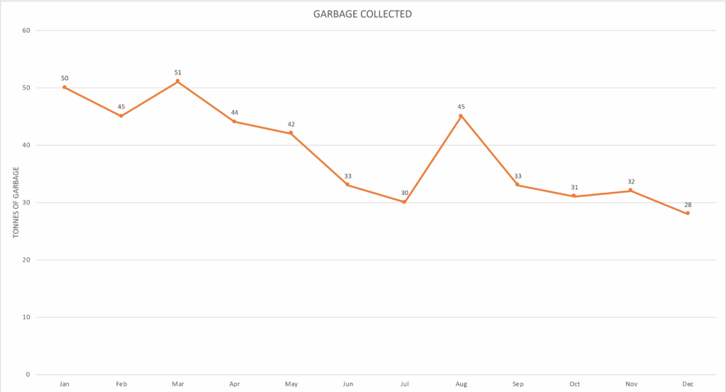
Color connotations vary widely across cultures and people within those cultures. Does this orange line have negative or positive connotations? Does it reference something religiously, politically, or culturally? Is it chosen for clarity? Is it a branding color? Different people may have different answers to this.
Let’s look at the same information in a different chart:
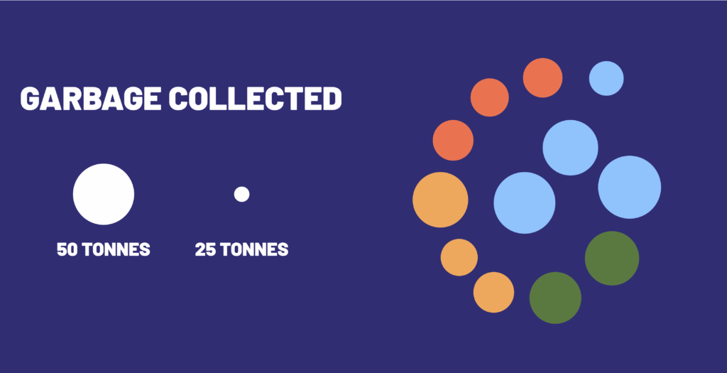
If you’re feeling more confused by this chart, take a second to hold that feeling. Maybe this chart isn’t one you’ve been trained in. You might not be sure what some elements represent. That is the feeling of something not designed with you in mind. Take a second to go through your understanding of each element.
Clearly size, position, color, shape and axes are playing different roles here. In this design, the axis of time spirals outward from the centre instead of left to right. The shapes are circles, each one representing a month, in order. But why circles? Is it clear to you that the author of this design is trying to represent the amount of garbage collected by the size of the colored circles? The colors are intended to reflect the season of that month (winter, spring, summer, fall), adding a dimension of communication that didn’t exist in the previous graph. Those colors may or may not have had that meaning to you at first glance.
This graph is less text reliant, shows time on a non-left-to-right axis, and emphasizes seasons over months. We’re not saying ‘it’s better’, it just might be better for certain audiences and that’s the point. The equity problem comes in when people say ‘it’s worse’. To them, we say: worse for who?
Here’s the same information in a different visualization:
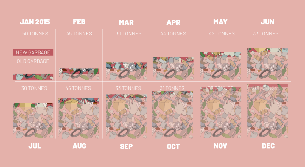
What are your interpretations of the elements (Color, Shape, Size, Position, Pattern, Icons, Images, Scale, Axes, Direction) here? Think carefully about each element. What are the units? What is the scale? What is the order of position? What do colors mean? What images are used to what effect?
Data viz can be a real rabbit hole, so before you get too lost, let’s look at the two key benefits of using a Reverse-Engineered Legend:
- Red Flags
- ‘Arbitrary’: If many elements of your design don’t mean anything to your audience, why did you use them? Is it arbitrary or just conditioned?
- ‘None’: If many design elements aren’t there, you might be missing an opportunity.
- Very specific: If your legend is very complicated, are you assuming a very high degree of literacy in this type of visualization?
- Cultural Translation
- Symbol Choice: Do the colors, icons, shapes and images mean what you want them to mean to your audience?
- Orientation: Does the structure of your visualization resonate with how your audience sees the aspects of the data.
- Text Use: If your visualization requires huge amounts of accompanying text and explanation, is it effective?
Data visualization design is usually a game of compromises. Complexity vs Clarity. Depth vs. Speed. Pretty vs. Practical. The best designs can maximize all of these, but usually, you have to pick. When designing data communication pick your audience with equity in mind and use a Reverse-Engineered Legend to design with them, not just for them.
