This article begins a 4 part series on what We All Count calls Identity Sorting Dials.
“If I want to be inclusive on my survey, shouldn’t I use as many identity options as possible?”
“If we want our results to be statistically significant, aren’t we going to need to aggregate our categories?”
“Why wouldn’t I do an intersectional analysis? Isn’t getting more specific categories better?”
“I want to see differences between racial groups, but the sample sizes for the groups I’m most worried about are too small to use!”
“If we want to get results than mean anything at all, we should use an “Other” category for all of the people who don’t fit into the big three groups…”
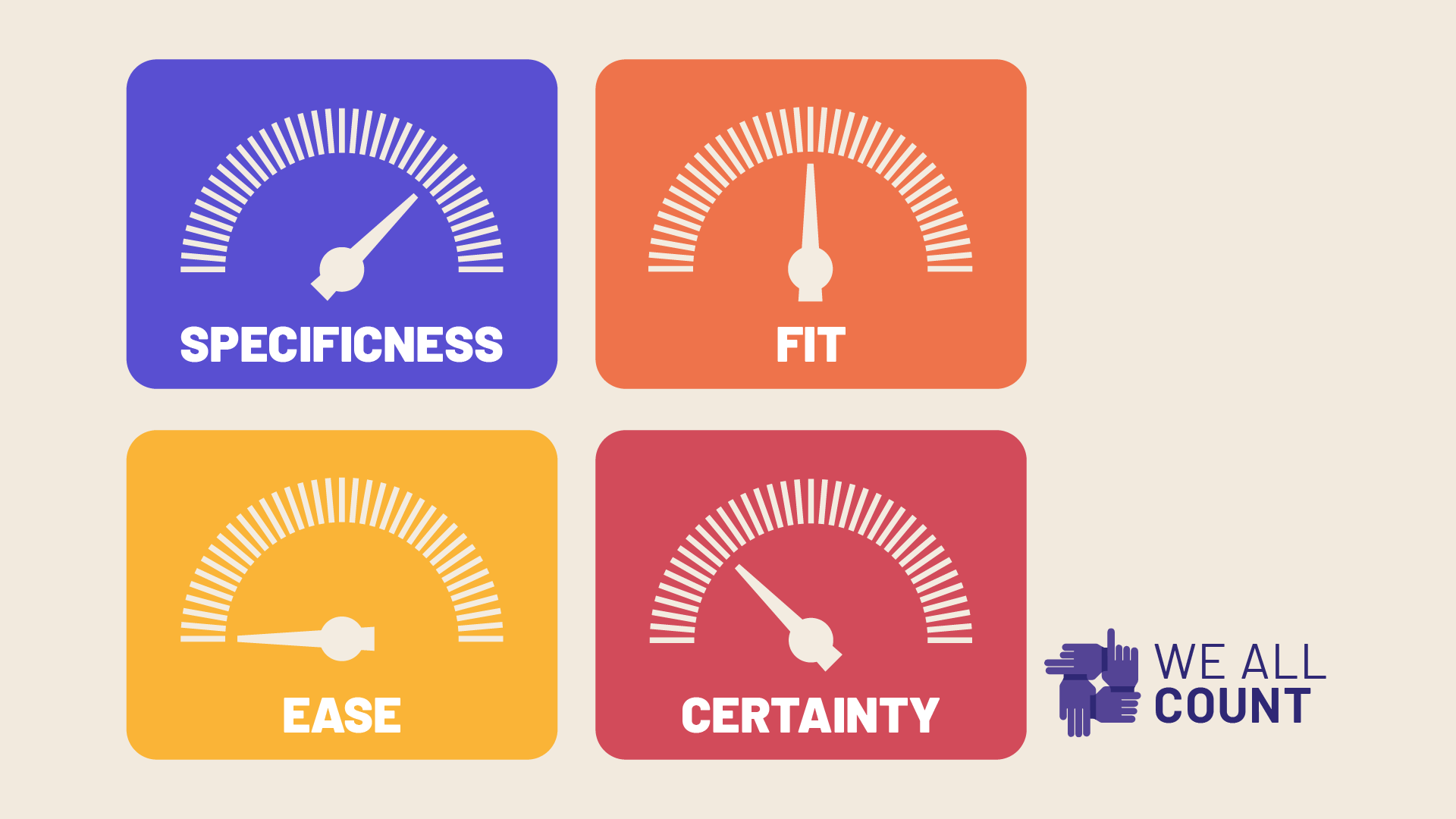
At We All Count, there are 4 dials that we think about any time we are breaking people out into groups in our data process. We think about them during data collection, during analysis, and during reporting. When we sort people into different “boxes” in our data, we need to be very intentional about what boxes we draw (and why!) and particularly how we are affecting the 4 key considerations in the Identity Sorting Dials.
Before we lay out some specific examples of how we use these dials across these stages of the data process, we wanted to give everyone a chance to familiarize themselves with exactly what we are measuring with each dial:
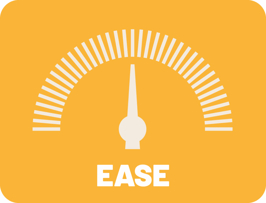
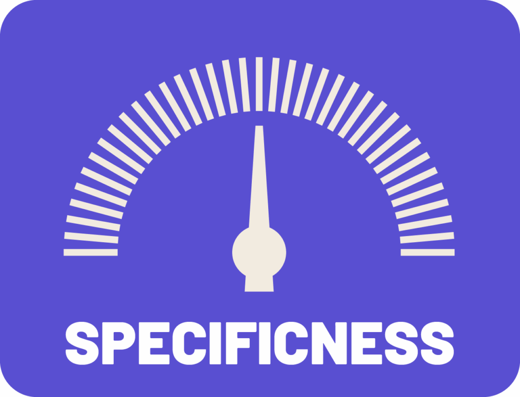
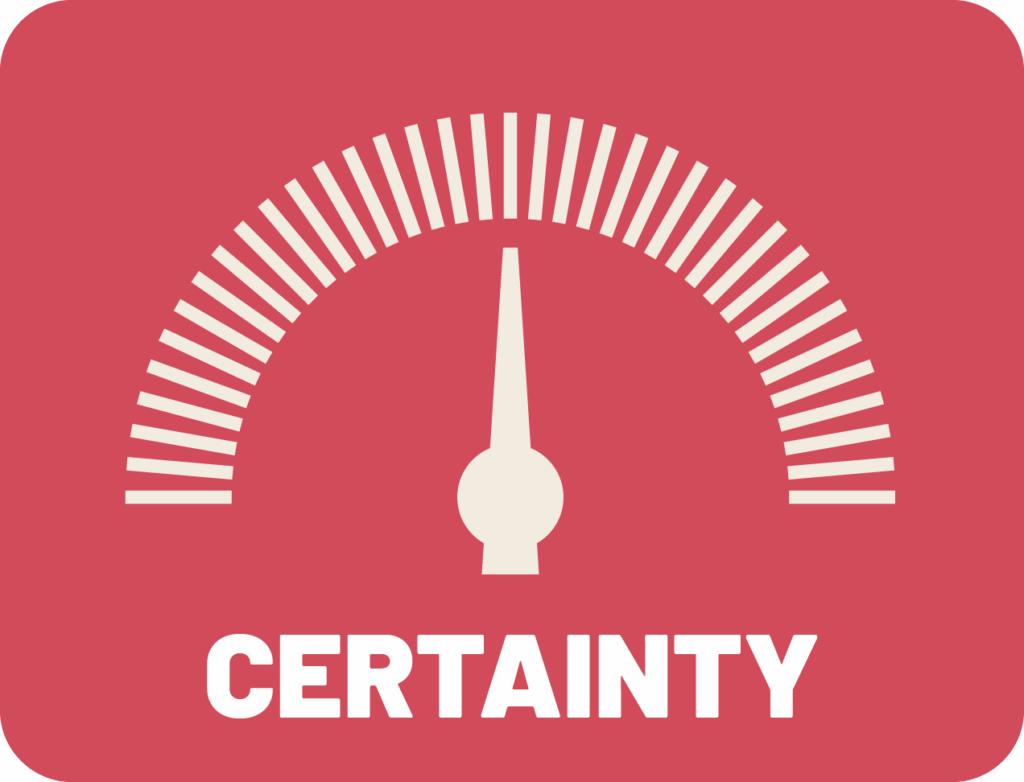
By thinking about how our choices affect these dials, we can make intentional, effective decisions about if and how we want to group people in our data. We can optimize compromises between these elements to support our project. We can make sure that the people we care about are being treated by the math the way we would treat them as people!
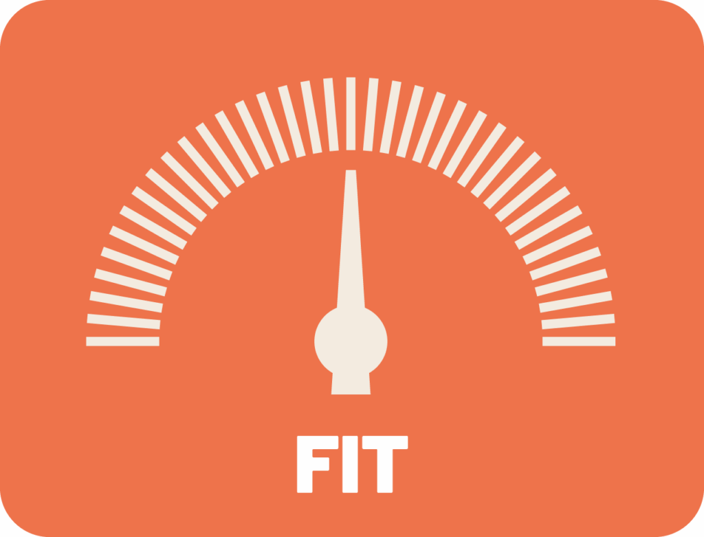
Fit
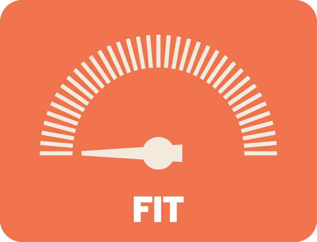
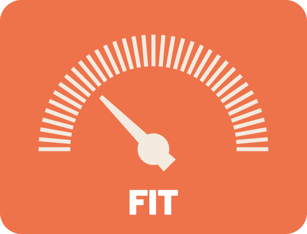

Fit means how well your grouping fits the individuals in that group. How effectively representative is your category? For example, if you are dividing people into groups based on a component of identity like sexual orientation, does the title or description of the group match how the individuals in that group would describe themselves. If I consider myself to be bisexual and my sexual orientation data is under the heading “bisexual” that is a good fit.
If I’m bisexual and I am forced to choose between options: Heterosexual or Homosexual, I have such a poor level on the fit dial that it’s hard to choose. I might choose “homosexual” because I feel that in a binary world of heterosexual = normal, homosexual=different, I’d choose to identify as different, but with these categories, the needle on the representitiveness dial totally bottoms out. I don’t see myself in either of these categories.
If I have options: Straight, Gay, or Other, and I choose Other, that’s less of a good fit than Bisexual, but maybe a little better. Other represents me more than Straight or Gay, but it doesn’t represent me well. If the options were: Straight, LGBTQ+, or Other, I might opt to put myself in the LGBTQ+ category, and nudge the representativeness dial up in comparison to “Other” but not as well as “Bisexual” which fits me like a glove. Representativness is important for respect and inclusivity, but it’s also important to getting the science right. A badly fit category is wide open for assumptions, prejudice, and misinterpretations of what the data really means.
Ease

Ease is how easily the person that the survey or report is intended for can engage with the information in the way that it is presented. If I see a report that includes my data, how easily will I be able to identify what grouping I’m in? If I’m answering a survey form, how complex are the questions? If I’m trying to interpret the meaning in a data table, how easy is it for me to understand the varying results between different groups?
Just like how the certainty, specificness, and fit of your categories will be different for different people in your project, ease will differ too. This dial is important because as we develop strategies to increase fit and specificity, and use increasingly complex explanations of certainty, we start to trade off ease of understanding to the point where we risk confusing, or downright losing people engaging with our data processes or products.
Some key points about the dials:
– Each dial goes from left to right, from low to high.
– Each dial measures the lowest mark across all of the groups in your project, so the representativeness dial only goes up to the mark for how representative your categories are for the least well-represented group. The certainty dial only goes up to the mark for the group you have the least certainty about. Etc.

Specificness
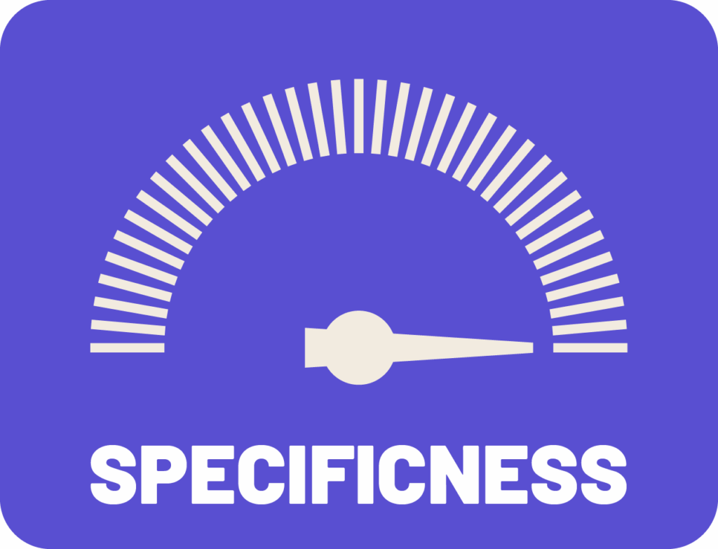

Specificness is how specifically the group describes me. It’s similar to fit, but instead of being about how well the category fits me, it’s about what level of specificity it is. For example, if I’m from Toronto, a category called “North American” is appropriate to me. I agree that I can be effectively described as North American, but it’s not as specific as Canadian, Ontarian, or Torontonian.
In fit, we’re concerned with “am I in the right box?”, with specificness we’re looking at the size of the box. I consider that “Torontonian” is a subset of “North American”, but “Bisexual” is not a subset of “Homosexual”. Increasing specificness improves the relevance and meaning that can be interpreted from our results. It a general sense it allows us to ask more exact questions and get more exact answers.
Certainty
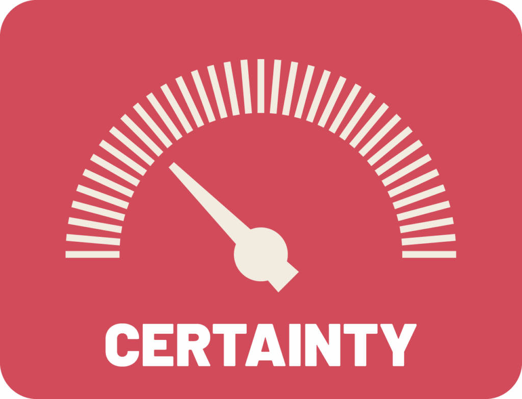
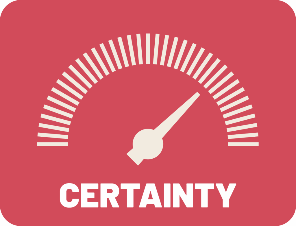
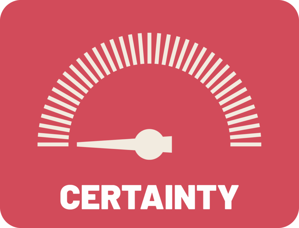
The certainty dial here refers to statistical certainty offered by the sample size of each of our groupings. Sample size isn’t the only thing that affects our point estimates and confidence intervals (important measures of how certain we are that a number reflects are reality) but it is a major factor and is largely determined by the groups we choose to put people’s data into.
Groupings with lots of people in them tend to lead to more robust results than can be interpreted with more confidence and certainty.
Categories with few people in them can produce so little certainty that we decide to suppress the results so that people don’t make conclusions based on them.
Increasing certainty when crafting groupings or categories can often come at a cost in specificity and fit in quantitative data science.
As we dive into the next few pieces exploring the use of these dials in data collection tools and processes, analysis and the eternal dilemma: “to aggregate or not to aggregate, that IS the question!”, and reporting, we’ll see how these dials are related to each other. It’s very hard to make one of these dials go up without making another go down. These dials sit at the intersection between the limits of statistical science as a tool, and the human priorities we need to care about when applying that tool to humans.
Data science offers the possibility of robust, reliable answers to important questions. It also offers the opportunity to celebrate and recognize the groups and identity components that make up who we are and the differences between our communities and lived experiences. However, we need to pay attention to both of these goals if we want to get either. If any of these dials bottom out during your data process, you’re going to have major problems. Science problems and equity problems (and guess what: when you’re using data about people, those are the same thing!)
