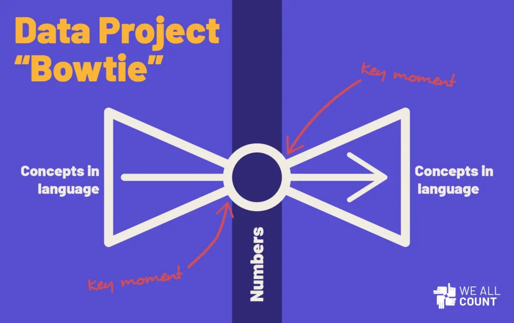
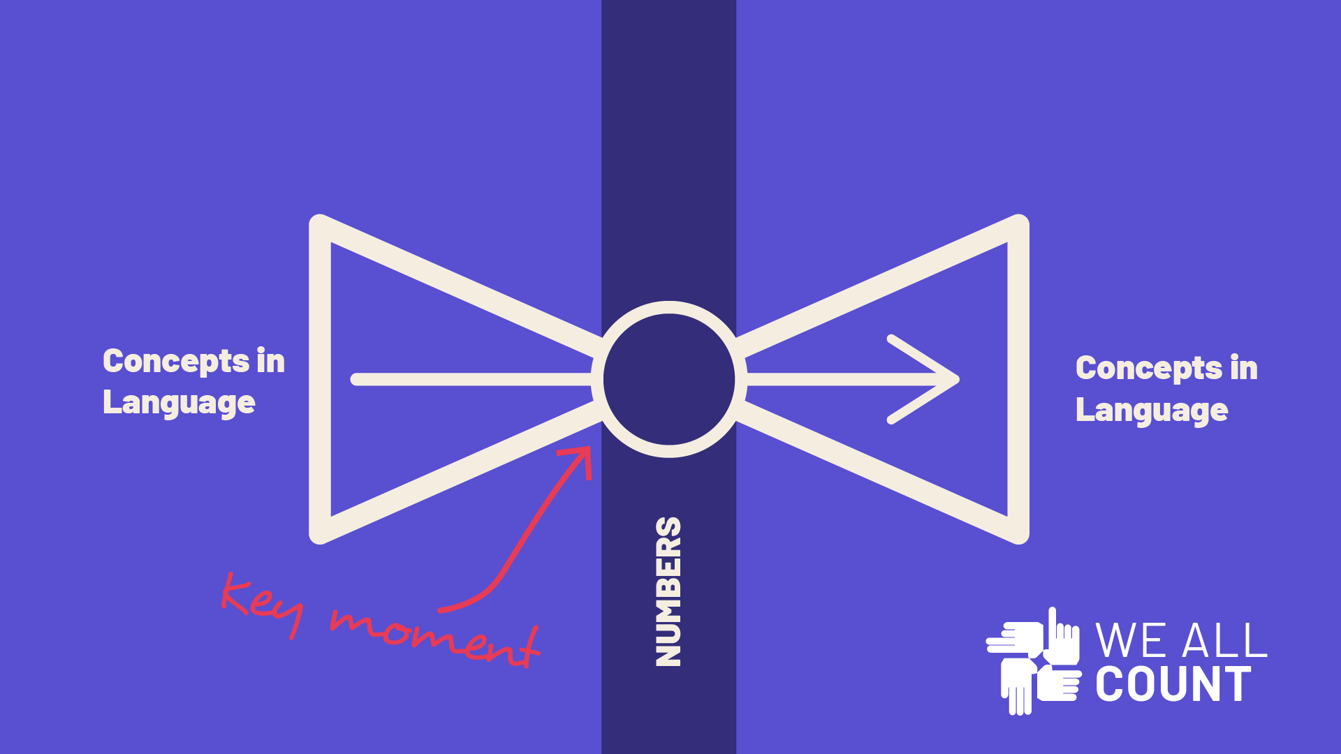
One of the best ways to talk about some of the equity challenges posed by the data science process is what we like to call the “bowtie”. The ends of the bowtie are almost always broader than the knot at the center, and it’s how you tie the knot that keeps the bowtie even.

In any data project about people, we’re starting from a broad, language-based set of conceptions, definitions and questions, figuring out how to turn those ideas into quantifiable numbers that we can engage with statistically, then turning those numbers back into answers or information related to complicated, language-based meaning. We might use numbers to make decisions, but ultimately decisions and knowledge are held in a linguistic realm.
Our perspectives, biases, and even prejudices enter this process at the moments when we attempt to transform an idea into a number and when we attempt to turn it back out into an idea.
Scope and Complexity:
One of the unavoidable ways that subjective perspectives are embedded into the data process is in selecting what kind of number you want to use to represent your concept.
For example, if I want to know about the prevalence of hunger in my country, what number should I collect? Self-reported “hungriness” on a scale from 1 to 10? Rates of malnutrition hospitalizations? A BMI average? How many times terms related to “hunger” appear on social media? The amount of imported and domestically produced food per capita?
Any of these might represent only a single dimension of a complex idea like hunger. Whichever of these I choose will reflect my definition of hunger, or whoever’s definition I adopt. That’s a data equity choice that needs to be made very intentionally.
We’re all familiar with how fraught it is to try and turn a nebulous, broad concept like “good teacher” or “smart student” or “effective school” into something that can be collected in a standardized test.
The issues of scope and perspective become most dangerous when a number gets turned back into an answer. “How is the economy doing?” is an incredibly complex question that many people want an answer to. Saying “the economy is strong” based on a number like a statistical trend in a stock market index might prioritize people and companies for whom stock performance is a major component of their “strong economy”. Saying the economic outlook is weak based on the number of hours that employees are having to work reflects a different one.
That doesn’t mean that there’s no point to the bowtie process. It’s incredibly important work to try again and again to harness the power of data to answer complex questions. Ask William Petty, Charles Davenant, and Simon Kuznets. All of them worked across centuries from each other to develop the metric of GDP and the evolution of that process from 1654 in England to China’s adoption of the measurement in 1993 is staggering. And money, as concepts go, is a lot easier to quantify than most human experiences and identities. The mistake is thinking that you can quantify something way too complex very easily. People debate the meaningfulness of GDP today and people have been working on it for about 350 years!
Our first recommendation to most people that We All Count works with is to significantly reduce the scope of what they suggest that their numbers actually mean. I think that standardized testing would be a lot less controversial if people reported the results of standardized tests as indicative of standardized test performance, and not blow it up to “how good are our schools?”.
Methodology and Interpretation:
The bow tie process isn’t only an issue of perspective and definitions however. One of the major challenges is making sure that the concept we are engaging with matches the mathematical process that we are running it through.
Let’s say that I want to test the effectiveness of my marketing materials using a causal model. I build a project that controls for a bunch of variables and tests various markets and I come out the other end with an indication that my ad blitz led to a 32% increase in sales. If I then take that “32%” number and say in my report: “our analysis concluded that continuing this marketing strategy over the next year will lead to a major increase in sales”, that’s a mistake. I set out to answer a causal question, and I’ve done a great job, but that’s totally different from the methods I’d need to use to get a predictive answer like that!
The jump from number back to concept is the very moment where the natural, storytelling, you-must-resist, slide from correlation to causality happens. And when dealing with people, jumping from a pattern like “transgender individuals routinely report lower levels of mental health” to “being trans causes lower levels of mental health” is both very incorrect and extremely damaging. An unfounded predjudiced jump from the meaning that a number contains to the relationship between the variables spreads poorly supported misconceptions and hinders processes that are working to demonstrate cause, like say, that the treatment and environment of transgender individuals might be the major factor intersecting with their mental health and transgender identity.
In the concept-number-concept bowtie, it’s crucial that how the numbers come out – how they are interpreted – matches how they went in.
What can we do?
So, I’m not writing this to discourage you from trying to use data to engage with ideas. It’s what I spend most of my days doing. What I’m trying to say is that the numbers we choose to represent our ideas and the math that we put them through reflect certain perspectives and power dynamics. We need to make sure we understand: A) it’s not easy, B) it’s never perfect, and C) in order to be fair, it needs to be transparent.
Working with someone’s data is essentially an act of caring about that person. It means you are trying to find answers relevant to them and to make them a meaningful part of the knowledge you are working to add to the world. Even better if you are sharing the fruits of this labor with them. If the people empowered to turn concepts into numbers are doing it with care and caution, and the rest of us can see the details of their noble attempts to do so, we’ll be 80%* of the way there in ensuring that every data project is a move towards equity.
*How did I calculate that 80%? Exactly.


